Skip to content

Chapter 8: Symbols, colour and brands

Reading icons and signs

How pictograms, safety signs and road signs work, from Isotype and the Olympic pictograms to where the power, Bluetooth, recycling, peace and wheelchair symbols came from.

In one minute

5 facts to know

  1. A pictogram looks like the thing it means, an ideogram shows an idea, and a symbol's meaning has to be learnt, like the peace sign or @.
  2. Otto Neurath's Isotype (Vienna, from 1925) taught that simple repeated figures explain facts better than tables. Tokyo 1964 began modern Olympic pictograms, and Otl Aicher's Munich 1972 set became the model for airport signs everywhere.
  3. In safety signs, red with a slash means don't, yellow triangles warn, blue circles tell you what you must do, and green means safe, such as the way out.
  4. Indian road signs: circles are mandatory, triangles are cautionary and rectangles are informatory. Stop is an octagon and Give Way an upside-down triangle.
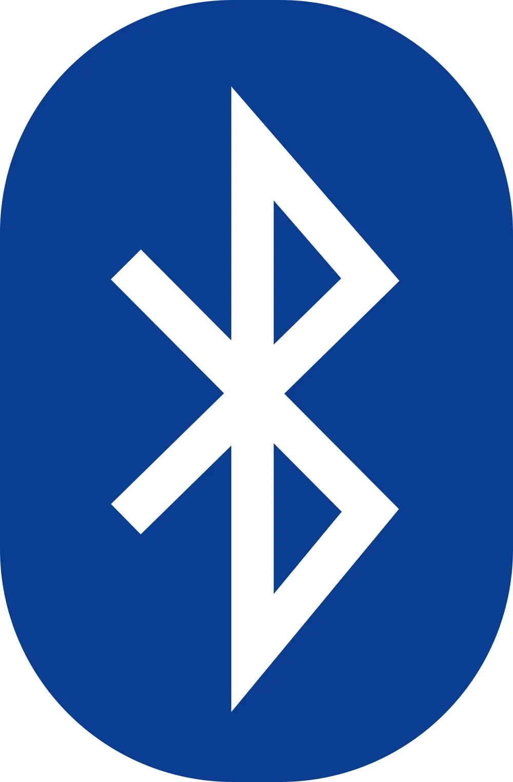
  5. Origins to know: radiation trefoil (Berkeley, 1946), biohazard (Dow, 1966), recycling (Gary Anderson, 1970), peace (Gerald Holtom, 1958), wheelchair (Susanne Koefoed, 1968), Bluetooth (King Harald's runes).

Pictures, ideas and symbols

A sign has to be understood in a second, by people who may not read the local language. Designers use three kinds of picture to do this, and exam questions often ask you to tell them apart.

Kind How it works Examples
Pictogram Looks like the thing it stands for A bus for a bus stop, a cup for a café
Ideogram Shows an idea or an instruction, not an object An arrow for "this way", a red slash for "not allowed"
Symbol Has no natural link to its meaning, so it must be learnt The peace sign, @, the biohazard sign

Most real signs mix them: a cigarette (pictogram) inside a red circle with a slash (ideogram) means "no smoking".

Pictures that explain facts: Isotype

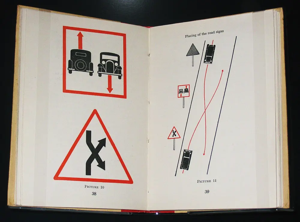
An open 1937 book with simple flat pictures of road signs: two cars passing in a red square, a red triangle with crossing arrows, and a plan of where the signs stand beside a road.
Picture: Otto Neurath. Public domain.

Isotype

Also called The Vienna Method of Pictorial Statistics

Where
Vienna, then The Hague and England
When
From 1925; named Isotype in the 1930s
Who
Otto Neurath, with the artist Gerd Arntz and Marie Neurath

Otto Neurath ran a museum of society and the economy in Vienna and wanted ordinary people to understand facts about their city. Instead of tables of numbers, his team drew simple, flat figures and repeated them: one little man might stand for a thousand workers, so ten men meant ten thousand. The artist Gerd Arntz drew most of the figures. When the team left Vienna in the 1930s the method was renamed Isotype, short for International System of Typographic Picture Education. This page is from Basic by Isotype (1937), which teaches simple English with pictures.

Spot it by

Rows of identical, flat, side-on figures in one or two colours, each standing for a fixed number.

Remember

Isotype counts with pictures: more men means more people, never a bigger man.

Don't confuse

An infographic today may scale one picture up or down. Isotype never did that; it repeated same-sized figures so they could be counted.
Signs for the Olympics

Tokyo 1964 Olympic pictograms

Where
Tokyo, Japan
When
1964
Who
Art director Masaru Katsumie; sports pictograms drawn by Yoshiro Yamashita

Few visitors to the 1964 Games could read Japanese, so the organisers gave the sports and the main services, such as toilets and first aid, their own picture signs. It was the first time an Olympics used a full, planned set of pictograms. Every Summer Games since has had its own set. Beijing 2008's set was based on ancient Chinese seal script, the writing carved on seals, which is why it looks like brushed black strokes (UCEED 2017 asked you to spot it).

Remember

Tokyo 1964 was the first Olympics to speak in pictures.
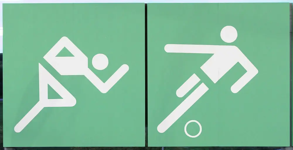
Two square green signs with white stick figures made of straight bars and circles: a runner leaning forward and a footballer kicking a ball.
Picture: Henning Schlottmann (User:H-stt), cropped by Canis dirus. CC BY 1.0.

Munich 1972 Olympic pictograms

Where
Munich, West Germany; these still hang at the Olympic station
When
1972
Who
Otl Aicher and his design team

Otl Aicher, a co-founder of the Ulm School of Design, led the whole look of the Munich Games: posters, tickets, uniforms and signs. Building on the Tokyo signs, his team drew every figure on a grid, with a round head, a simple body, and limbs set only at right angles or 45 degrees. The result was so clear that it became the model for public signs around the world.

Spot it by

Stick figures built from thick bars and circles, with limbs only at right angles or 45 degrees.

Remember

Aicher put athletes on graph paper.

Signs for travellers

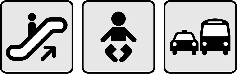
Three square black-on-grey pictograms: a person on an escalator going up, a baby, and a taxi beside a bus.
Picture: Klork. Public domain.

The DOT symbol signs

Also called AIGA symbol signs

Where
United States, now used worldwide
When
34 symbols in 1974; 16 more in 1979
Who
The US Department of Transportation and the AIGA (American Institute of Graphic Arts), drawn by Roger Cook and Don Shanosky

American airports and stations were full of home-made signs that looked different everywhere. The Department of Transportation asked the AIGA to fix this. Its committee collected signs already in use around the world, including Tokyo's and Munich's, scored them for how clearly they read, and then had Cook and Shanosky draw a single family of symbols. Because they were made for the US government, anyone may use them free. The man and woman figures on many toilet doors around the world come from this set.

Spot it by

Solid black, rounded, friendly figures with round heads, all the same weight, usually in a square.

Remember

The toilet-door man and woman date from 1974.

Safety signs: colour plus shape

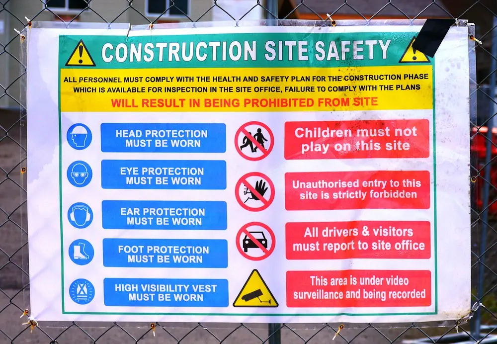
Workplace and public safety signs follow two international standards: ISO 3864, which sets the colours, shapes and layout, and ISO 7010, which lists the approved pictures. The idea is that the shape and colour tell you the kind of message before you even read the picture.

A building site notice with blue circles showing a hard hat, goggles, ear defenders, boots and a safety vest on the left, and red circles with slashes over children, a hand and a car on the right, plus a yellow triangle with a camera.
Picture: Rick Obst. CC BY 4.0.

ISO safety signs

Where
Used worldwide; this notice is from a building site
Who
International Organization for Standardization (ISO 3864 and ISO 7010)

This one notice uses three kinds of sign. The blue circles are mandatory signs: wear a helmet, goggles, ear protection, boots and a bright vest. The red circles with a slash are prohibition signs: no children, no unauthorised entry, no cars. The yellow triangle is a warning: cameras are watching. Green rectangles (not shown) mark safe things such as exits and first aid, and red rectangles mark fire equipment.

Spot it by

Red slash means don't, blue circle means do, yellow triangle means careful, green means safe.

Remember

Read the shape first, then the picture.
Colour Shape Meaning Example
Red, with a slash Circle Prohibition: don't do this No smoking
Yellow, black border Triangle Warning: danger here Electricity, slippery floor
Blue Filled circle Mandatory: you must do this Wear a helmet
Green Rectangle or square Safe condition Emergency exit, first aid

Red rectangles are a fifth kind, for fire-fighting equipment such as extinguishers.

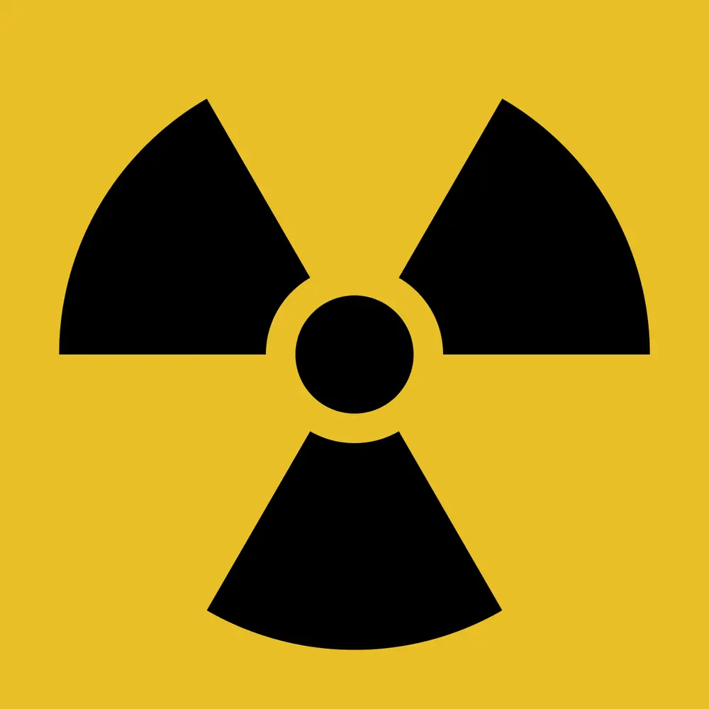
A black three-bladed fan shape around a small black circle, on a yellow square.
Picture: Original unknown; vector by Uwe W. Public domain.

Radiation warning symbol

Also called The trefoil

Where
First used at the University of California, Berkeley
When
1946
Who
A team at Berkeley's Radiation Laboratory

The trefoil (three leaves) shows a small circle, the source, with three blades of radiation spreading out. The first signs were magenta on blue; today the standard version is black on yellow. It warns of ionising radiation, from X-ray machines as well as radioactive material. It became an international ISO standard in the 1960s and 1970s.

Spot it by

Three wide blades around a dot, with gaps between them, usually black on yellow.

Remember

A dot that shines three ways: radiation.

Don't confuse

The biohazard sign also has three parts, but they are thin, overlapping rings, not solid blades.
A black symbol of three open, overlapping rings joined around a small central circle.
Picture: Silsor. Public domain.

Biohazard symbol

When
1966
Who
Charles Baldwin, an engineer at Dow Chemical, with the US National Institutes of Health

Laboratories needed one warning for dangerous germs and other biological material. Dow's team drew dozens of designs and tested them on people. Baldwin said they wanted a shape that was memorable but meaningless, so that it would not be confused with anything else and people could be taught what it means. It is a pure symbol: it does not look like a germ at all. UCEED 2015 showed it beside the chemical weapon, radiation and toxic signs and asked you to name each.

Spot it by

Three crescent-like rings that overlap, open at the outer edge, around a small circle.

Remember

Biohazard is built to mean nothing until you learn it.

Indian road signs

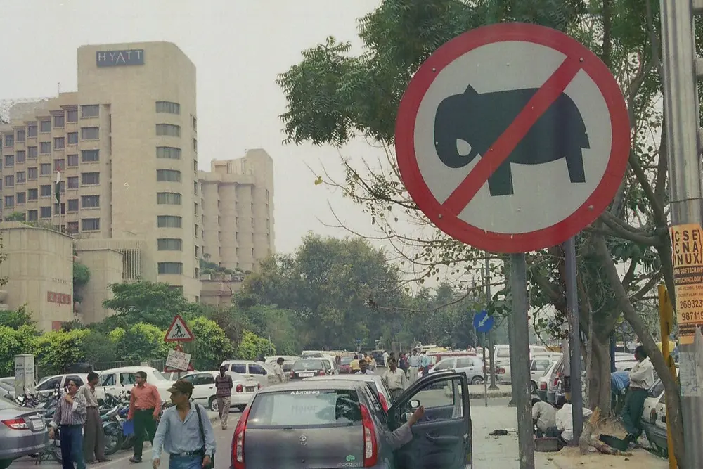
A round road sign with a red border and a red slash across a black elephant, on a busy New Delhi street, with a triangular pedestrian sign and a blue round sign in the background.
Picture: Nathaniel ayer. CC BY-SA 3.0.

Road signs in India

Where
This sign is in New Delhi
Who
The Motor Vehicles Act and the Indian Roads Congress guidelines (IRC:67)

India uses three families of road sign, told apart by shape. Mandatory signs are circles, and breaking them is an offence: a red border means something is prohibited (this one bans elephants), and a blue circle gives an order such as "turn left" or "sound horn". Cautionary signs are triangles with a red border that warn of what is ahead, such as a school, a sharp bend or a pedestrian crossing (see the triangle at the back of this picture). Informatory signs are rectangles that give directions, distances and facilities like petrol pumps and hospitals. Two signs have shapes of their own so they stand out: Stop is a red octagon, and Give Way is a triangle pointing down.

Spot it by

Circle means obey, triangle means take care, rectangle means information.

Remember

Circle commands, triangle cautions, rectangle informs.

Don't confuse

CEED 2024 showed Give Way, No Entry, a height limit, No Overtaking and No Stopping. No Entry is a red disc with a white bar; No Stopping is a blue disc with a red cross.

Where common symbols come from

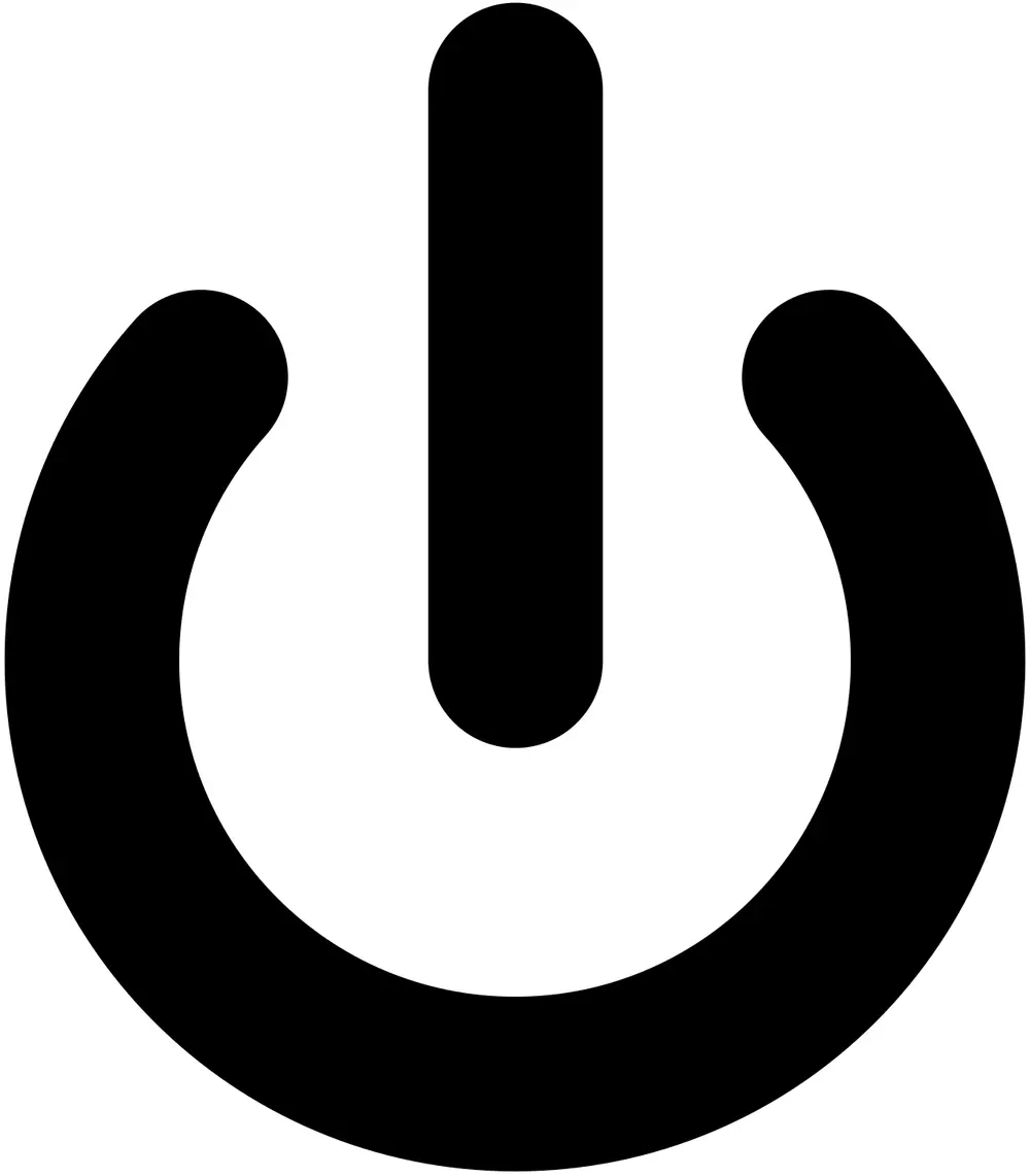
A thick black circle broken at the top, with a short upright line coming down into the gap.
Picture: User:Klork. Public domain.

Power symbol

When
In the IEC's symbol standard by 1973
Who
Set by the International Electrotechnical Commission (IEC 60417)

The power button joins a line and a circle. They are usually explained as the binary digits 1 (on) and 0 (off), placed one over the other. Strictly, the broken circle with a line inside is the IEC's standby symbol; a plain line means fully on and a plain circle means fully off.

Spot it by

A circle with a gap at the top and a line dropping into it.

Remember

1 and 0 on top of each other: on and off.
Three black folded arrows chasing each other round in a triangle.
Picture: Krdan. Public domain.

Recycling symbol

When
1970, for the first Earth Day
Who
Gary Anderson, then a university student in California

The Container Corporation of America, which made boxes from recycled paperboard, ran a design contest for students. More than 500 entries came in, and Anderson won with three arrows that fold like a Möbius strip, a loop with a twist that has only one side, so the loop never ends. The company dropped its claim to own the design, so the symbol is free for anyone to use.

Spot it by

Three bent arrows following each other in a triangle.

Remember

Three arrows, one endless loop: use, collect, make again.

Don't confuse

Plastic items often carry the arrows around a number from 1 to 7. That number names the kind of plastic; it does not promise the item will be recycled.
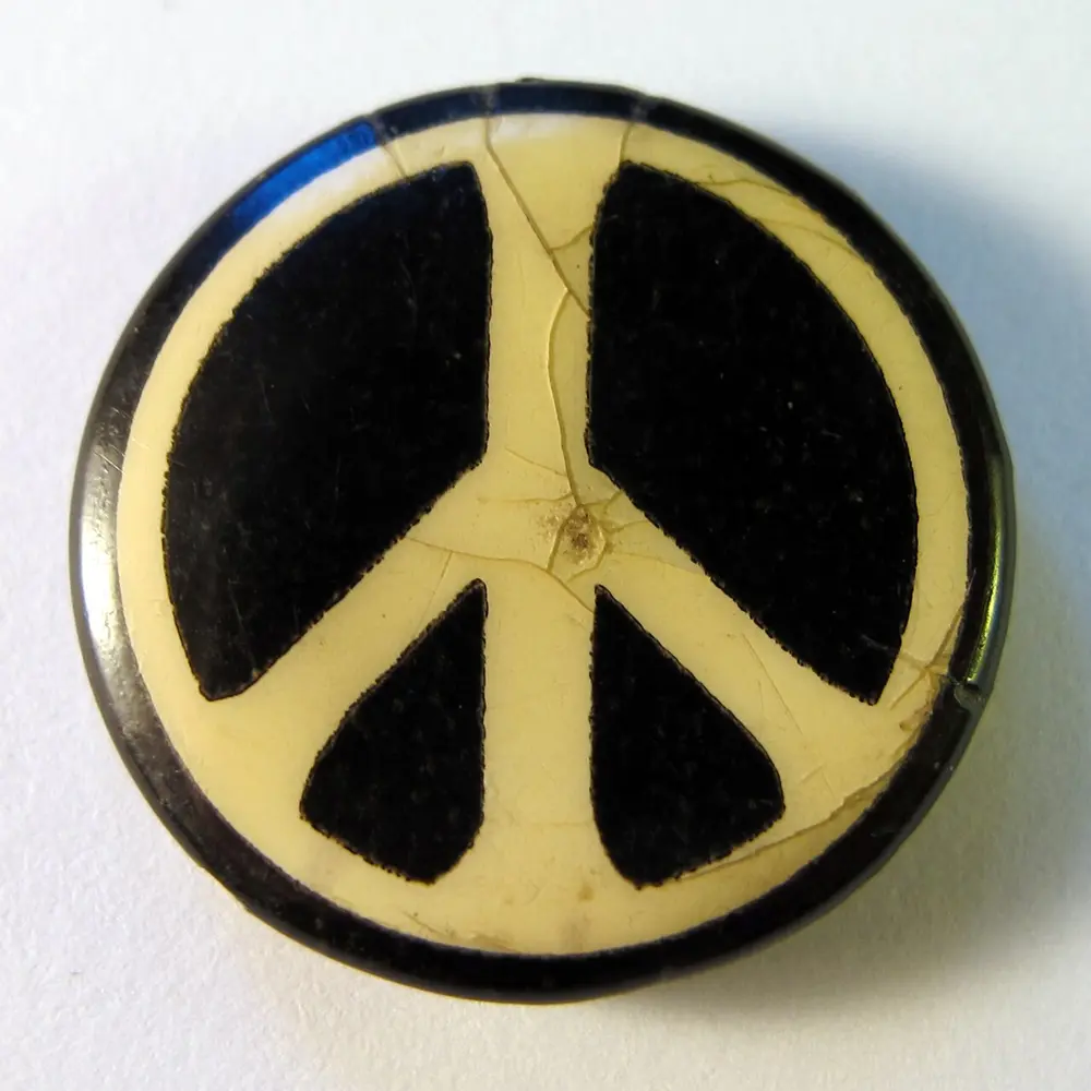
An old round cream badge with a black circle and, inside it, a cream upright line with two lines sloping down from its centre, leaving four black wedges.
Picture: Gerald Holtom, photographed by BirchallDanny. CC0.

Peace symbol

Also called Designed as the CND symbol

Where
Britain
When
Designed in February 1958
Who
Gerald Holtom, a British artist and designer

Holtom designed it for a protest march from London to the Atomic Weapons Research Establishment at Aldermaston at Easter 1958. It joins two letters of flag semaphore, the code of signalling with two hand-held flags: N (both flags held down and out) and D (one flag straight up, one straight down), for Nuclear Disarmament. It became the badge of the Campaign for Nuclear Disarmament (CND). Holtom never copyrighted it, so it spread to peace movements everywhere. This 1960s badge shows his early version, with lines that widen towards the edge.

Spot it by

A circle with a line down the middle and two lines sloping down from its centre.

Remember

N plus D in flags: no nukes.
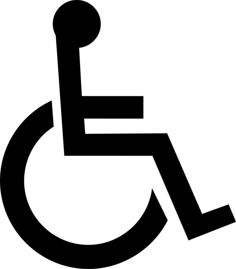
A black symbol of a seated stick figure with a round head, in a wheelchair drawn as an open circle.
Picture: United States Department of Transportation. Public domain.

International Symbol of Access

Also called The wheelchair symbol

When
Drawn in 1968; adopted in 1969
Who
Susanne Koefoed, a Danish design student; head added by Karl Montan

Rehabilitation International, a disability rights organisation, wanted one sign to mark buildings people in wheelchairs could use. In 1968 a committee picked Koefoed's design, a figure on a wheelchair drawn in lines of equal thickness. Karl Montan, who led the selection committee, added a round head so it would read as a seated person, and the symbol was adopted at the organisation's 1969 congress in Dublin. It is now in the ISO 7001 standard, usually white on blue.

Spot it by

A stick figure seated on a circle, white on a blue square.

Remember

Koefoed drew the chair; Montan gave it a head.
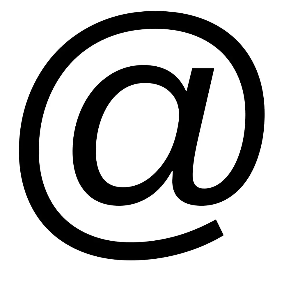
The at sign: a small letter a with a long curved tail circling round it.
Picture: MeekMark at English Wikipedia. Public domain.

The @ sign

When
Put into email addresses in 1971
Who
Ray Tomlinson, an engineer at BBN in the United States

Long before email, shopkeepers and accountants used @ to mean "at the rate of", as in "5 pens @ 10 rupees". In 1971 Ray Tomlinson sent messages between computers on a network, and needed a mark to split a person's name from the name of their computer. He picked @ from his keyboard because it would never be part of anyone's login name, and "name at computer" made sense. That is still how every email address works: name @ place.

Remember

@ means "at": you are at your computer.
A plain red heart emoji.
Picture: Twitter. CC BY 4.0.

Emoji

Where
Japan
When
Shigetaka Kurita's set, 1999
Who
Shigetaka Kurita, for the mobile company NTT DoCoMo

Emoji is Japanese: e means picture and moji means character. Kurita designed a set of 176 tiny pictures, each on a grid of 12 by 12 pixels, for DoCoMo's i-mode phone internet service in 1999. He took ideas from manga, weather maps and street signs. It is the best-known early set, though historians have since found that a Japanese phone sold by J-Phone had a smaller set in 1997. In 2016 the Museum of Modern Art in New York added Kurita's 176 emoji to its collection. This heart is a modern design from Twitter's free emoji set.

Remember

E plus moji: picture plus letter.

Don't confuse

Emoticons are faces typed from ordinary keys, like :-) . Emoji are pictures.
Three thick black horizontal bars stacked one above another.
Picture: Timothy Miller. Public domain.

Hamburger menu

When
1981
Who
Norm Cox, for the Xerox Star computer

The Xerox Star was one of the first office computers with windows, icons and a mouse. Cox drew a tiny button of three lines that looks like the list it opens, and he had only about 16 by 16 pixels to do it in. It was little used for years, then came back from about 2009, when phone apps needed to hide their menus to save space. People call it the hamburger because the lines look like a bun, a patty and a bun.

Spot it by

Three equal horizontal lines in a corner of the screen.

Remember

Three lines, a menu inside.

Timeline

  1. 1925

    Otto Neurath's museum in Vienna begins the method later called Isotype

  2. 1946

    The radiation trefoil is first used at Berkeley

  3. 1958

    Gerald Holtom designs the peace symbol for the Aldermaston march

  4. 1964

    Tokyo is the first Olympics with a full set of pictograms

  5. 1966

    Dow Chemical's biohazard symbol is introduced

  6. 1968

    Susanne Koefoed draws the wheelchair symbol, adopted in 1969

  7. 1970

    Gary Anderson's recycling symbol wins a contest for the first Earth Day

  8. 1971

    Ray Tomlinson puts @ into email addresses

  9. 1972

    Otl Aicher's pictograms for the Munich Olympics

  10. 1974

    The first 34 DOT and AIGA symbol signs

  11. 1981

    Norm Cox's three-line menu icon on the Xerox Star

  12. 1997

    Bluetooth is named after King Harald

  13. 1999

    Shigetaka Kurita's 176 emoji for NTT DoCoMo

Test yourself

Question 1 of 8

Which of these warns of dangerous germs and other biological material?

Question 2 of 8

On this safety notice, what do the blue circles tell you?

Question 3 of 8

In India, a round sign with a red border like this one belongs to which family of road signs?

Question 4 of 8

Who designed these pictograms, drawn on a strict grid for the 1972 Olympics?

Question 5 of 8

This logo joins two runes. Whose initials are they?

Question 6 of 8

The peace symbol on this badge combines which two letters of flag semaphore?

Question 7 of 8

Gary Anderson designed the recycling symbol in 1970 for

Question 8 of 8

Which Indian road sign is an octagon?

From past papers

Real exam questions on this topic, each with a full solution.

Finished this note?

Mark it as studied to track your progress through the course.

Was this note useful?

Each picture is credited underneath it. Pictures of works still in copyright are shown small, for teaching only. If you hold the rights to a picture and want it removed, tell us through the contact page and we will take it down.