Skip to content

Chapter 8: Symbols, colour and brands

Logos and brand identities

The seven kinds of logo and the true stories behind famous ones, from Nike's swoosh and FedEx's hidden arrow to Air India's Maharaja, the Doordarshan eye and India Post.

In one minute

6 facts to know

  1. A logo can be a wordmark (Coca-Cola), a lettermark (IBM), a picture (Apple), an abstract shape (Nike), a mascot (Air India's Maharaja), an emblem, or a combination of symbol and name.
  2. Carolyn Davidson drew Nike's swoosh in 1971 for $35. Rob Janoff drew Apple's bitten rainbow apple in 1977. Lindon Leader's FedEx logo (1994) hides an arrow between the E and the x.
  3. Pierre de Coubertin designed the Olympic rings in 1913. No ring stands for a particular continent: that story is a myth.
  4. Bobby Kooka and Umesh Rao created Air India's Maharaja in 1946; the 2023 "Vista" logo is the top of a gold window frame. R.K. Laxman drew Asian Paints' Gattu in 1954.
  5. The Doordarshan eye was designed by an NID student, Devashis Bhattacharyya. India Post's red and yellow logo dates from 2008.
  6. Swachh Bharat (2014) uses Gandhi's spectacles, Make in India (2014) a lion made of gear wheels, and Incredible India (2002) an exclamation mark for the I.

What a logo is

A logo is the mark a company, government body or event puts on everything it makes, like a signature. A brand identity is the whole family around it: the logo, colours, typefaces, mascot, slogan and even sounds, used the same way everywhere so that people recognise the brand at a glance. One of the first complete identities was Peter Behrens's work for the German company AEG from 1907 (see Design movements).

Designers sort logos into seven kinds:

Kind What it is Example
Wordmark (logotype) The name written in its own special lettering Coca-Cola
Lettermark (monogram) Only the initials IBM, drawn by Paul Rand
Pictorial mark A picture of a real thing Apple's apple
Abstract mark A shape that isn't a real object Nike's swoosh
Mascot A character who stands for the brand Air India's Maharaja
Emblem Words set inside a badge, seal or crest Harley-Davidson's bar and shield
Combination mark A symbol and the name used together Airtel's red "a" above the word airtel

Many logos mix kinds, and they change over time. Nike's swoosh sat beside the word Nike for much of its history; today it often appears alone.

Stories behind world-famous logos

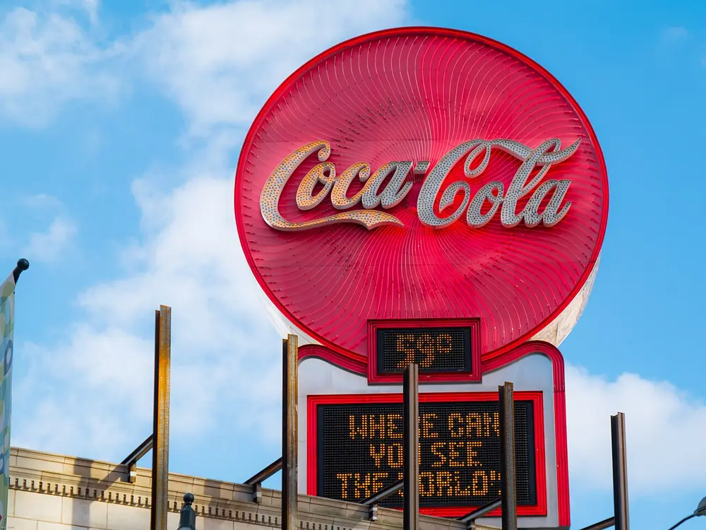
A large round red neon sign with the words Coca-Cola in flowing white joined-up handwriting, on a rooftop against a blue sky, above a small electronic board.
Picture: Marc Merlin. CC BY-SA 4.0.

Coca-Cola script

Where
Atlanta, United States; this neon sign is on the Olympia Building in Five Points, Atlanta
When
Name and script from 1886; registered as a trademark in 1893
Who
Frank M. Robinson, partner and bookkeeper of the chemist John Pemberton
Style
Wordmark

Pemberton, a chemist in Atlanta, first sold his new drink in May 1886. His partner and bookkeeper, Frank M. Robinson, named it after two of its ingredients, coca leaves and kola nuts. He then wrote the name in Spencerian script, the elegant joined-up handwriting that American clerks and bookkeepers were trained in at the time. The lettering has been tidied up over the years but never replaced, so it is one of the oldest logos still in use. This sign stands in Atlanta, the city where the drink was invented.

Spot it by

Red and white flowing handwriting, with two big curling capital Cs and a hyphen in the middle.

Remember

A bookkeeper's handwriting became the world's most famous signature.
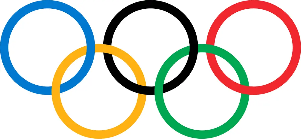
Five interlocking rings in two rows on white, blue, black and red on top and yellow and green below.
Picture: Pierre de Coubertin. Public domain.

The Olympic rings

When
Designed 1913; first raised at an Olympic Games in Antwerp in 1920
Who
Pierre de Coubertin, founder of the modern Olympic Games, France
Style
Abstract mark

Coubertin drew the five linked rings in 1913 and presented them in the Olympic magazine that August. The five rings stand for the five inhabited parts of the world, joined together by the Games. He wrote that the ring colours, blue, yellow, black, green and red, together with the white background, could make up the flag of every nation of the time. The Olympic flag was first raised at a Games in Antwerp in 1920, the first Olympics after the First World War.

Spot it by

Five interlocking rings in a W shape: blue, black and red on top, yellow and green below.

Remember

Five rings for the five parts of the world; six colours, counting the white, for every flag.

Don't confuse

A popular story says each colour stands for one continent, such as blue for Europe. The IOC printed that once, in 1949 to 1950, then withdrew it in 1951 because Coubertin never said it. No ring stands for any particular continent.
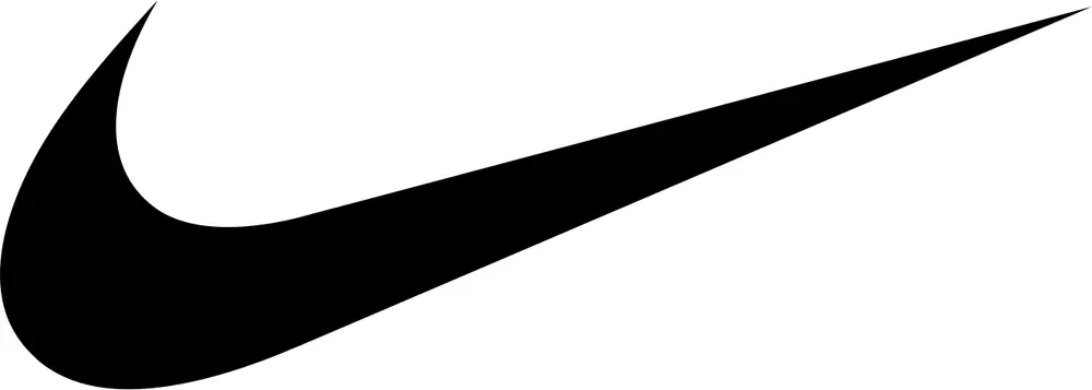
A single black curving shape like a fast tick mark, rounded at the bottom left and sweeping up to a sharp point at the right, on white.
Picture: Carolyn Davidson for Nike. Public domain (simple shape; Nike trademark).

Nike swoosh

Where
Portland, Oregon, United States
When
1971
Who
Carolyn Davidson, a graphic design student at Portland State University
Style
Abstract mark

Phil Knight, who taught accounting at Portland State, was launching his own brand of sports shoes and needed a "stripe", the trade word for the mark on the side of a shoe. He asked Davidson, a design student, for a mark that showed movement and didn't look like the three stripes of Adidas. She showed him several ideas; he chose this one, admitting he didn't love it but thought it might grow on him. She billed the company $35. In 1983 Knight thanked her with a gold swoosh ring set with a diamond and 500 Nike shares.

Spot it by

One curved, tapering tick shape, usually black or white, often with no name beside it.

Remember

A $35 student job became the world's best-known tick.

Don't confuse

The swoosh is often described as the wing of Nike, the Greek goddess of victory. Davidson's brief was simply to show motion, so treat the wing as a story told about the mark.
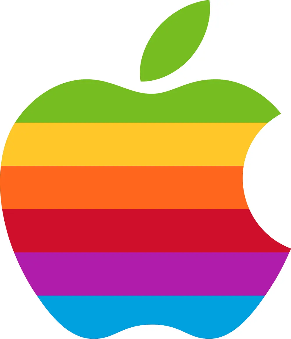
An apple shape with a leaf on top and a round bite out of its right side, striped from top to bottom in green, yellow, orange, red, purple and blue.
Picture: Rob Janoff for Apple. Public domain (simple shape; Apple trademark).

Apple's bitten apple

Where
Regis McKenna agency, Palo Alto, California
When
1977; the rainbow stripes were dropped at the end of the 1990s
Who
Rob Janoff
Style
Pictorial mark

Apple's first logo, drawn in 1976 by co-founder Ronald Wayne, was a detailed picture of Isaac Newton sitting under an apple tree. In 1977 the young designer Rob Janoff, at the Regis McKenna agency, replaced it with a simple apple shape. He has said he added the bite so that, even when small, it would read as an apple and not a cherry. The rainbow stripes showed off that the new Apple II computer could display colour. Apple dropped the stripes at the end of the 1990s and now uses the same shape in a single colour.

Spot it by

An apple with one leaf tilting to the right, and a single round bite out of the right-hand side.

Remember

The bite says "apple, not cherry".

Don't confuse

Two myths: that the bite honours the computer scientist Alan Turing, and that it is a pun on the computer word "byte". Janoff has called the Turing story an urban legend, and says the byte joke was only pointed out to him after the design was done.
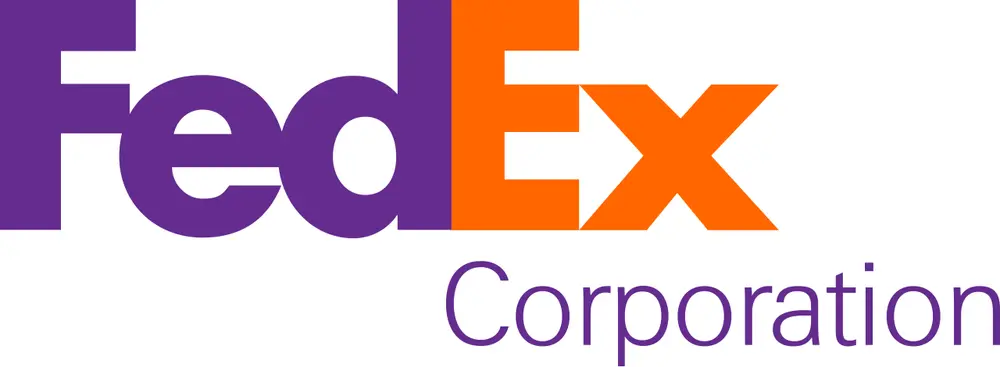
The word FedEx in heavy letters, Fed in purple and Ex in orange, with the word Corporation in smaller letters below; the white gap between the E and the x forms an arrow pointing right.
Picture: FedEx. Public domain (text logo; FedEx trademark).

FedEx hidden arrow

Where
Landor Associates, San Francisco
When
1994; this version 2016
Who
Lindon Leader, of Landor Associates
Style
Wordmark

In 1994 Federal Express shortened its name to FedEx, the nickname customers already used, and asked Landor Associates for a new logo. Leader says the arrow wasn't planned. Partway through the work he noticed that a capital E beside a lower-case x hinted at one, so the team drew a custom typeface, based on Univers and Futura, and fitted the letters tightly until the gap became a clean arrow. That gap is negative space: the empty space between and around shapes, which can carry a picture of its own. Leader said the arrow suggests getting from one place to another quickly and precisely.

Spot it by

Purple Fed and orange Ex in heavy letters, with a white arrow pointing right between the E and the x.

Remember

Look at the gap: FedEx hides its arrow in the white.

Air India: the Maharaja and the Vista

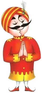
A cartoon man with a round face, a big curled black moustache and a red and yellow striped turban, wearing a red and gold coat and folding his hands in a namaste.
Picture: Air India. Copyright Air India, shown for teaching.

Air India's Maharaja

Also called The Maharajah

When
1946
Who
Bobby Kooka, Air India's commercial director, and Umesh Rao, an artist at the advertising agency J. Walter Thompson
Style
Mascot

Kooka dreamed up the character and Rao drew him in 1946, the year Tata Airlines became Air India. He wasn't really a king: Kooka said they called him a Maharaja "for want of a better description". For decades he starred in Air India's posters and ads around the world, often dressed up for the city being advertised, and he became one of India's best-loved mascots.

Spot it by

A round-faced man with a curling moustache, a long nose and a striped turban, often bowing or doing a namaste.

Remember

The Maharaja joined Air India in its very first year, 1946.
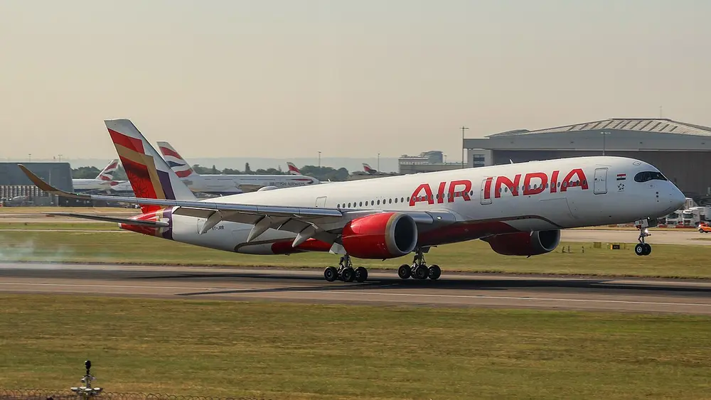
A white Airbus A350 jet with the airline's name in big red letters along its body, red engines and a red, purple and gold tail, speeding along a runway at London Heathrow.
Picture: S5A-0043. CC BY 4.0.

Air India's 2023 rebrand

Also called The Vista

Where
This plane was photographed at London Heathrow in 2025
When
Unveiled 10 August 2023
Who
FutureBrand, a London agency, for Air India
Style
Combination mark and livery

After the Tata Group took Air India back from the government in 2022, the airline set out to look new. On 10 August 2023 it unveiled a logo called the Vista: the name in a new typeface with a small gold shape above it, the pointed top of a window frame inspired by the jharokha, the carved overhanging window of Indian palaces. A livery is the paint scheme a company puts on its vehicles, and Air India's new one is deep red, aubergine purple and gold. The Vista replaced the red flying swan with the Konark wheel inside it, used since 2007. The Maharaja stayed, but in the background, on things like crockery and in premium lounges.

Spot it by

The words Air India with a small gold window-top shape, and tails in red, purple and gold.

Remember

Vista means view, so the new logo is the top of a window.

Don't confuse

The 2007 logo was a flying red swan with the orange Konark wheel inside it. The Vista has no swan.

Asian Paints' Gattu

Gattu

Where
Asian Paints, Mumbai
When
1954 to the early 2000s
Who
R.K. Laxman, cartoonist
Style
Mascot

Asian Paints' mascot from 1954 was Gattu, a mischievous little boy with a paint bucket in his hand. He was drawn by R.K. Laxman, the cartoonist best known for his Common Man, the silent, puzzled onlooker of his daily cartoons in The Times of India. Gattu appeared on tins and in ads for about fifty years, until the company changed its identity in the 2000s, dropped him and later shortened its logo to the letters AP.

Spot it by

A cheeky boy with a paint bucket, drawn in Laxman's quick, loose cartoon line.

Remember

Laxman drew two famous Indians: the Common Man and Gattu.

Amul's little girl in a polka-dot dress is India's other famous brand mascot; she belongs with Indian advertising and posters.

Logos of Indian public bodies

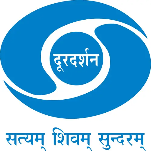
A blue eye shape made of two curving swirls around a circle that holds the word Doordarshan in Devanagari, above the Sanskrit motto Satyam Shivam Sundaram in blue.
Picture: Doordarshan. Copyright Prasar Bharati, shown for teaching.

Doordarshan eye

Also called DD logo

Where
Designed at NID, Ahmedabad, for Doordarshan, New Delhi
When
Designed in the early 1970s; on screen from 1976
Who
Devashis Bhattacharyya, an NID student, guided by his teacher Vikas Satwalekar; animated by R.L. Mistry
Style
Abstract mark with the name inside

Doordarshan, India's public television broadcaster, began in Delhi in 1959 and became separate from All India Radio in 1976. When it needed a symbol, NID students and teachers sent in fourteen designs, and Prime Minister Indira Gandhi chose Bhattacharyya's. He had sketched a human eye and wrapped two curves around it, which he compared to yin and yang, the Chinese symbol of two halves that complete each other. Another NID graduate, R.L. Mistry, animated it so the two halves swirl together, and the spinning eye opened Doordarshan's broadcasts for years. The motto below, Satyam Shivam Sundaram, means "truth, goodness, beauty"; later versions dropped it.

Spot it by

A blue eye made of two swirling halves around a central circle, sometimes with दूरदर्शन written in the middle.

Remember

Doordarshan means "far sight", so its logo is an eye.

Don't confuse

In April 2024 the DD News channel turned its version of the eye saffron; the shape stayed the same.

Logos for national campaigns

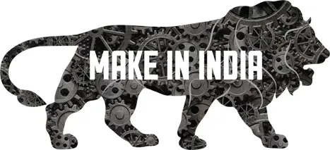
The side view of a walking lion filled with grey and black gear wheels, with the words Make in India in white capital letters across its body.
Picture: Make in India, Government of India. Copyright Government of India, shown for teaching.

Make in India lion

When
September 2014
Who
The Indian office of the advertising agency Wieden+Kennedy, for the Ministry of Commerce and Industry
Style
Pictorial mark

Make in India was launched in September 2014 to persuade companies to make their products in India. Its logo is a striding lion built from gear wheels, also called cogs. The agency took the lion from the Lion Capital of Ashoka, the source of India's national emblem, to stand for strength and courage, and the cogs stand for factories and manufacturing.

Spot it by

A walking lion in silhouette, filled with gear wheels.

Remember

A lion made of cogs means India as a factory with courage.

Don't confuse

The Lion Capital shows lions sitting back to back. The Make in India lion walks, and is made of machine parts.
The words Incredible India in black serif letters, with an exclamation mark with a red dot standing in for the capital I of India.
Picture: Ministry of Tourism, Government of India. Public domain (text logo).

Incredible India

When
2002
Who
The Ministry of Tourism with the agency Ogilvy & Mather; the campaign was led by Amitabh Kant, then a joint secretary in the ministry
Style
Wordmark

Before 2002, India promoted tourism mostly with leaflets and brochures. That year the Ministry of Tourism hired Ogilvy & Mather for a proper international campaign. Its wordmark turns the I of India into an exclamation mark, the punctuation of surprise, so the logo itself says "incredible". The exclamation mark was also used on its own across the campaign's posters.

Spot it by

The word India beginning with an exclamation mark instead of a capital I.

Remember

India with a "!" for its I.

A brand rebuilt: Airtel

A large red curving ribbon shape like a lower-case letter a, above the word airtel in red lower-case letters.
Picture: Airtel. Public domain (text logo; Airtel trademark).

Airtel's 2010 rebrand

When
18 November 2010
Who
The Brand Union, a London agency (now part of Superunion), for Bharti Airtel
Style
Combination mark

In June 2010 Bharti Airtel bought the mobile networks of the Kuwaiti company Zain in 15 African countries and wanted one brand for every market. On 18 November 2010 it replaced its old logo with a red, ribbon-like lower-case "a" above the name, also in lower case, and its African networks took the same name within days. A.R. Rahman, who composed Airtel's famous signature tune, made a new version for the launch. A rebrand like this changes the whole identity at once: logo, colours, shop signs, advertising and even the sound.

Spot it by

A red, ribbon-like curl shaped like a lower-case a, above the word airtel.

Remember

In 2010 Airtel went to Africa and got its red "a".

How exams test logos

  • Spot the real logo. UCEED and CEED often show four near-identical versions of one logo and ask which is correct: Apple (UCEED 2018 and CEED 2018), Axis Bank (UCEED 2021), Mahindra (CEED 2021) and India Post (UCEED 2025). Check which way the parts point (Apple's leaf tilts right and its bite is on the right), where the words sit, the spacing between letters, and whether the version has been flipped.
  • Match the logo to its owner. CEED 2020 asked students to match logos with the Election Commission of India, Aadhaar, SAIL, FICCI and the India Design Mark. Notice the logos of public bodies around you.
  • Name the designer. UCEED 2015 asked who designed famous Indian logos, such as R.K. Joshi's Punjab National Bank symbol (see Design in India).

Indian logos at a glance

Logo Year What it shows Made by
Air India Maharaja 1946 A moustached Maharaja mascot Bobby Kooka and Umesh Rao
Asian Paints Gattu 1954 A boy with a paint bucket R.K. Laxman
Doordarshan early 1970s, on screen 1976 An eye of two swirling halves Devashis Bhattacharyya (NID)
Incredible India 2002 An exclamation mark for the I Ministry of Tourism and Ogilvy & Mather
India Post 2008 A red envelope with yellow wings Ogilvy & Mather
Airtel 2010 A red ribbon "a" The Brand Union, London
Swachh Bharat 2014 Gandhi's spectacles Anant Khasbardar, via a MyGov contest
Make in India 2014 A lion made of gear wheels Wieden+Kennedy India
G20 India 2022 The Earth in a lotus Government of India, from a MyGov contest
Air India Vista 2023 The top of a gold window frame FutureBrand, London

Timeline

  1. 1886

    Frank M. Robinson names Coca-Cola and writes it in Spencerian script

  2. 1913

    Pierre de Coubertin designs the Olympic rings

  3. 1920

    The Olympic flag is raised at a Games for the first time, in Antwerp

  4. 1946

    Bobby Kooka and Umesh Rao create Air India's Maharaja

  5. 1954

    R.K. Laxman draws Gattu for Asian Paints

  6. 1971

    Carolyn Davidson designs the Nike swoosh for $35

  7. 1976

    Doordarshan separates from All India Radio, with its NID-designed eye

  8. 1977

    Rob Janoff's rainbow apple replaces Apple's Newton logo

  9. 1994

    Lindon Leader's FedEx logo, with its hidden arrow

  10. 2002

    The Incredible India campaign begins

  11. 2008

    India Post's new red and yellow logo, part of Project Arrow

  12. 2010

    Airtel's red "a" replaces its old logo

  13. 2014

    Make in India's lion in September; Swachh Bharat's spectacles on 2 October

  14. 2022

    India unveils its G20 logo, a globe in a lotus

  15. 2023

    Air India unveils the Vista logo and a new livery

Test yourself

Question 1 of 8

A design student was paid $35 for this mark in 1971. Which company is it for?

Question 2 of 8

What is hidden in the white space of this logo?

Question 3 of 8

Who designed this logo in 1977?

Question 4 of 8

Which of these logos was designed by a student of NID?

Question 5 of 8

Whose spectacles does this logo show?

Question 6 of 8

This lion is made of gear wheels. Which campaign is it the logo of?

Question 7 of 8

Who drew Gattu, the Asian Paints mascot, in 1954?

Question 8 of 8

What did Coubertin say about the colours of the Olympic rings?

From past papers

Real exam questions on this topic, each with a full solution.

Finished this note?

Mark it as studied to track your progress through the course.

Was this note useful?

Each picture is credited underneath it. Pictures of works still in copyright are shown small, for teaching only. If you hold the rights to a picture and want it removed, tell us through the contact page and we will take it down.