Skip to content

Chapter 4: Design history and designers

Designers to know

The product, graphic, type and fashion designers exams name, from Raymond Loewy and Dieter Rams to Paul Rand, Otl Aicher, Adrian Frutiger and Issey Miyake, with the one work to remember each by.

In one minute

6 facts to know

  1. Raymond Loewy styled cars, buses, logos and even a pencil sharpener (UCEED 2015). His rule was MAYA: "most advanced, yet acceptable".
  2. Dieter Rams of Braun wrote ten principles of good design and the motto "less, but better". Jony Ive's Apple products owe a lot to him.
  3. Philippe Starck's Juicy Salif (1990) is a lemon squeezer shaped like a squid; Naoto Fukasawa's Muji CD player works like a kitchen fan.
  4. Paul Rand drew the IBM logo, Milton Glaser drew I Love NY (1977), Saul Bass made film posters and title sequences, and Massimo Vignelli made the 1972 New York subway map.
  5. Otl Aicher designed the pictograms of the Munich 1972 Olympics. Paul Renner made Futura (1927), Eric Gill made Gill Sans (1928), and Adrian Frutiger made Univers (1957) and Frutiger (1976).
  6. Coco Chanel gave women simple, comfortable clothes and the little black dress; Issey Miyake pleated whole garments after they were sewn.

Product designers

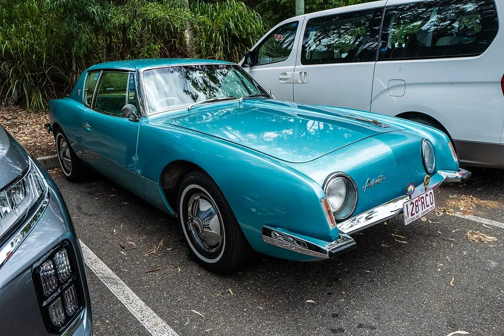
A low, smooth turquoise sports coupe from 1963 with round headlamps, a thin chrome bumper and no front grille, parked in a car park beside a white van.
Picture: John Robert McPherson. CC0.

Raymond Loewy

Where
Born in Paris; worked in New York from 1919
When
1893 to 1986
Who
French-born American industrial designer
Key works
Studebaker Avanti car (1962); Lucky Strike cigarette pack; Shell and Exxon logos; Greyhound bus interiors; Coca-Cola vending machines; Air Force One colours

Loewy is often called a father of industrial design because he worked on almost everything: trains, cars, buses, fridges, packaging and logos. In 1949 he was on the cover of Time magazine. This car is the Studebaker Avanti, launched in April 1962, whose smooth, grille-less nose was shaped by his team. His rule for new products was MAYA, "most advanced, yet acceptable": go as far ahead as buyers will still accept. His streamlined trains are in the design movements note.

Spot it by

Smooth, rounded, fast-looking shapes, even on objects that never move.

Remember

Loewy styled everything from a locomotive to a pencil sharpener.

Don't confuse

UCEED 2015 showed his streamlined pencil sharpener, a teardrop on a stand, and offered "turbine engine" as a trap answer.
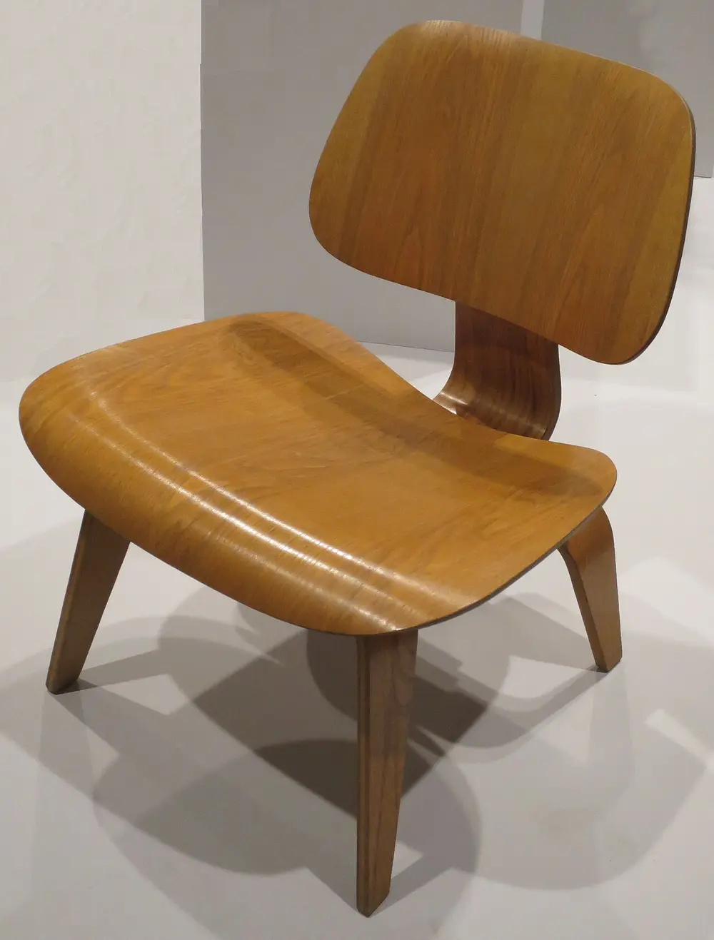
A low chair made of two curved panels of golden plywood, a seat and a back, joined by a bent plywood spine and standing on four plywood legs.
Picture: Hiart. CC0.

Charles and Ray Eames

Also called Lounge Chair Wood (LCW)

Where
Their office in Venice, Los Angeles
When
Chair designed 1945 to 1946; Charles 1907 to 1978, Ray 1912 to 1988
Who
American husband-and-wife design team
Made with
Moulded plywood with rubber shock mounts
Key works
LCW chair (1946); Eames Lounge Chair (1956); Powers of Ten film (1977); the India Report (1958)

During the Second World War the Eameses made moulded plywood leg splints for the US Navy, and they used the same skill to bend plywood into chairs. The LCW is a seat and a back, each a gently curved plywood panel, held on a plywood spine. They went on to make the leather Eames Lounge Chair (in the design movements note) and short films such as Powers of Ten. For India they matter even more: their India Report of 1958 led to NID (see the Design in India note).

Spot it by

Warm plywood bent into soft curves, separate seat and back panels, and thin legs.

Remember

Eames means plywood that bends.

Don't confuse

CEED 2018 showed Mies van der Rohe's Barcelona Chair (1929), a steel X-frame with leather cushions, and offered the Eameses and Philippe Starck as wrong answers.
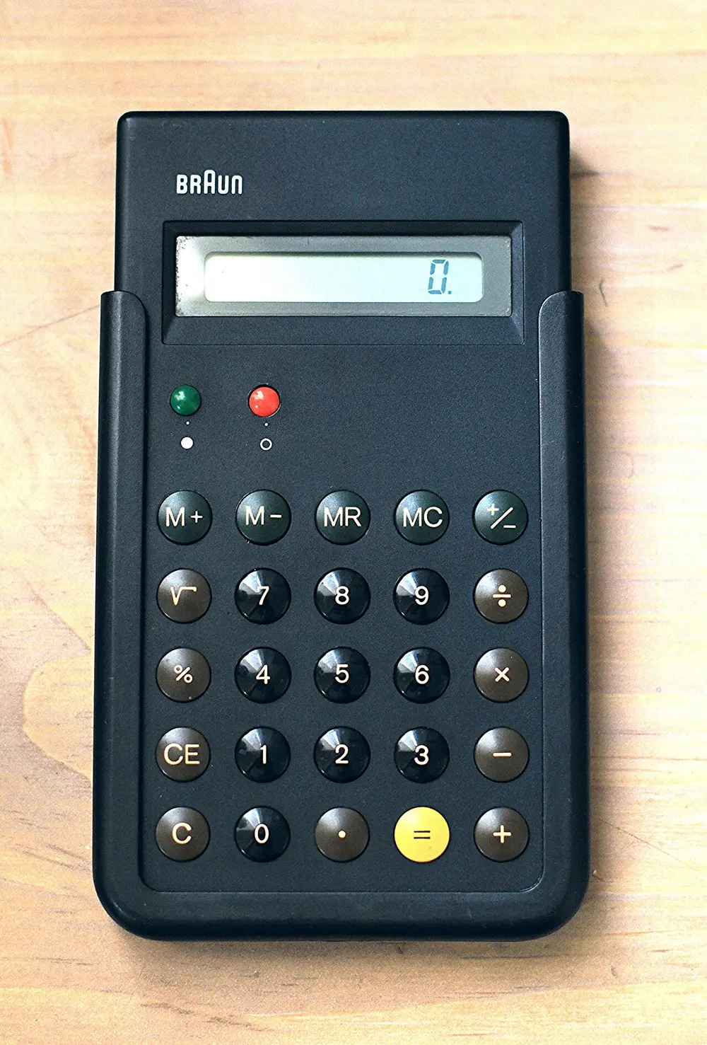
A slim black pocket calculator marked Braun, with a small grey display and rows of round, domed buttons, a yellow equals key, and red and green dots near the top.
Picture: Pinot Dita from Kuwait. CC BY-SA 2.0.

Dieter Rams

Where
Braun, Germany
When
Born 1932; joined Braun in 1955 and led its design from 1961
Who
German industrial designer
Key works
SK 4 radio-phonograph (1956, with Hans Gugelot); 606 Universal Shelving System for Vitsoe (1960); ET66 calculator (1987, with Dietrich Lubs)

Rams spent his career at the German electrical company Braun, making radios, shavers, clocks and calculators calm, plain and easy to use. His motto is "less, but better", and he set down ten principles of good design (below). The ET66 calculator shown here has domed buttons and a single yellow key for "equals". Apple's designers openly admired his work: the iPhone's calculator app was modelled on the ET66, and the first iPod is often compared with his Braun T3 pocket radio.

Spot it by

Black, white or grey boxes, a few neat controls, one bright colour used as a signal, and nothing extra.

Remember

Rams: less, but better, in ten rules.

Don't confuse

Mies van der Rohe said "less is more". Rams says "less, but better".

Dieter Rams's ten principles

Good design... What it means
is innovative It uses new technology to do things in a new way
makes a product useful It helps the object do its job well
is aesthetic It is pleasant to look at and live with
makes a product understandable You can tell how to use it just by looking
is unobtrusive It is a quiet tool, not a show-off
is honest It doesn't pretend to be more than it is
is long-lasting It doesn't go out of fashion quickly
is thorough down to the last detail Nothing is left to chance
is environmentally friendly It saves materials and energy
is as little design as possible Back to basics: less, but better
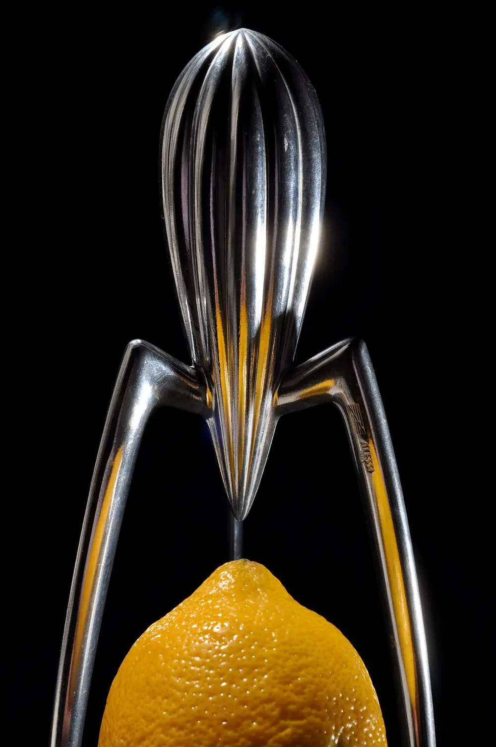
A tall, shiny aluminium lemon squeezer shaped like a ribbed teardrop on three long thin legs, with a lemon placed below it, against a black background.
Picture: Niklas Morberg. CC BY-SA 2.0.

Philippe Starck

Also called Juicy Salif lemon squeezer

Where
Paris; made by Alessi, Italy
When
Born 1949; Juicy Salif 1990
Who
French designer
Made with
Cast and polished aluminium
Key works
Juicy Salif (1990); Louis Ghost chair for Kartell; rooms in the French president's Élysée Palace (1983)

Starck designs everything from toothbrushes and chairs to hotels and yachts. The Juicy Salif began as squid sketches on a restaurant napkin, drawn while he squeezed lemon over a plate of squid, and the Italian firm Alessi made it in 1990. Critics say it is messy to use, yet it sits in museums such as MoMA in New York and the V&A in London. People argue over it because it puts a striking shape ahead of how well it works. His Louis Ghost chair for Kartell turned an old French armchair shape into one piece of clear moulded plastic.

Spot it by

Playful, sculptural shapes in shiny metal or see-through plastic.

Remember

Starck's lemon squeezer is a squid on stilts.
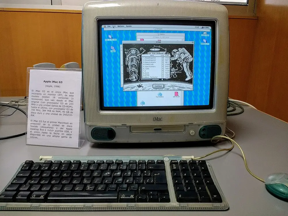
An egg-shaped all-in-one computer of see-through blue-green and white plastic with a curved screen showing a game, a matching see-through keyboard and a round mouse, on a museum desk beside a label.
Picture: David Abián. CC BY-SA 4.0.

Jony Ive

Also called Sir Jonathan Ive

Where
Born in London; worked at Apple in California
When
Born 1967; at Apple from 1992 to 2019
Who
British industrial designer
Key works
iMac G3 (1998); iPod (2001); iPhone (2007); iPad (2010); Apple Watch (2015)

Ive joined Apple in 1992 and became its head of design after Steve Jobs returned. His first big success was the iMac of 1998, an all-in-one computer in see-through coloured plastic at a time when computers were beige boxes. He then led the design of the iPod, iPhone and iPad, and was Apple's chief design officer from 2015. In 2019 he left to start the design firm LoveFrom with the Australian designer Marc Newson, whose aluminium Lockheed Lounge chair has set auction records for a living designer.

Spot it by

Rounded corners, white or see-through plastic, smooth aluminium, very few buttons.

Remember

Ive turned the beige computer into a blue jelly sweet.

Don't confuse

Dieter Rams worked for Braun in Germany; Ive worked for Apple and says Rams inspired him.
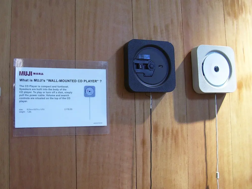
Two square CD players hanging on a wooden wall in a shop, one white and one black, each with a long cord hanging down, next to a Muji sign explaining the wall-mounted CD player.
Picture: Myself (Wikimedia Commons user). Public domain.

Naoto Fukasawa

Also called Wall-mounted CD player

Where
Japan; made for Muji
When
Born 1956; CD player 1999
Who
Japanese product designer
Key works
Wall-mounted CD player for Muji (1999); Infobar mobile phones for KDDI

Fukasawa noticed that a spinning CD looks like the blades of a kitchen extractor fan, so he made a CD player that hangs on the wall and starts when you pull its cord, just like the fan. It is in the collection of MoMA in New York. His idea of designing "Without Thought" means shaping objects around the things people already do without thinking. He has advised the Japanese no-brand shop Muji since 2002.

Spot it by

Very plain white or grey objects that look obvious once you see them.

Remember

Pull the cord and the music spins, like a fan.

Graphic designers

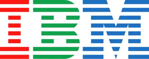
The letters IBM in heavy blocks, each cut into eight horizontal stripes, the I in red, the B in green and the M in blue.
Picture: Paul Rand. Public domain (text logo; IBM trademark).

Paul Rand

Also called IBM logo

Where
New York
When
1914 to 1996; IBM logo 1956, striped version 1972
Who
American graphic designer
Key works
Logos for IBM, UPS, ABC, Westinghouse and Steve Jobs's company NeXT

Rand believed a logo should be simple enough to remember after one look. He designed IBM's logo in 1956 and added the stripes in 1972, which make the heavy letters look lighter and more lively. IBM is usually printed in one colour; this coloured version is one of its variants. He also taught graphic design at Yale University.

Spot it by

Bold, simple letter shapes and basic geometry.

Remember

Rand put IBM in stripes.
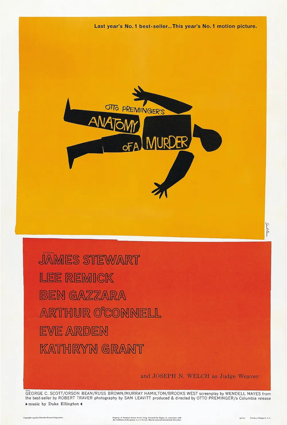
A film poster with a black cut-paper silhouette of a body broken into pieces on a yellow-orange panel, the title Anatomy of a Murder hand-lettered across it, and the cast names on a red panel below.
Picture: Saul Bass. Public domain.

Saul Bass

Also called Anatomy of a Murder poster

Where
Los Angeles
When
1920 to 1996; this poster 1959
Who
American graphic designer and film-maker
Key works
Title sequences for The Man with the Golden Arm (1955), Vertigo (1958), North by Northwest (1959) and Psycho (1960); the AT&T globe logo; the United Airlines tulip

Before Bass, film posters usually showed painted scenes and stars' faces. He used a single bold symbol instead, made of cut paper, like the broken body on this poster. He also turned a film's opening credits into a short film of their own, with moving shapes and type, for directors such as Alfred Hitchcock and Otto Preminger. Later his firm designed company logos used for decades.

Spot it by

Flat cut-paper shapes, jagged edges, one strong symbol, hand-cut letters and bold flat colours.

Remember

Bass cut a whole film down to one paper shape.
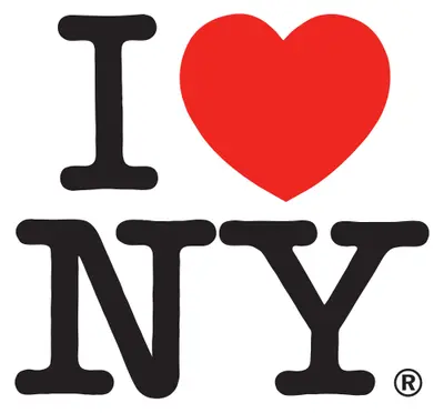
The capital letter I followed by a red heart, with the letters N and Y below, all in a heavy rounded typeface.
Picture: Milton Glaser. Public domain (text logo; New York State trademark).

Milton Glaser

Also called I Love NY

Where
New York
When
1929 to 2020; logo for the 1977 tourism campaign
Who
American graphic designer
Key works
I Love NY logo; Bob Dylan poster (1966); co-founder of Push Pin Studios (1954) and New York magazine

When New York State wanted to bring tourists back in the 1970s, Glaser sketched this logo with a red crayon in the back of a taxi, and he did the work for free. The heart stands for the word "love", so the logo reads as a little sentence of letters and a picture. It has been copied all over the world. In 2009 he was the first graphic designer to receive the US National Medal of Arts.

Spot it by

A word replaced by a picture, letters stacked in a square, in the typeface American Typewriter.

Remember

Glaser's heart replaced a word.
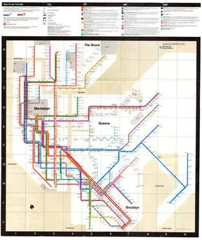
A subway map of New York drawn as a diagram, with coloured lines running only straight across, up and down or at 45 degrees, beige blocks for land and a white grid of squares.
Picture: Massimo Vignelli. Copyright Metropolitan Transportation Authority, shown for teaching.

Massimo Vignelli

Also called New York subway map

Where
Born in Milan; worked in New York
When
1931 to 2014; map 1972
Who
Italian designer, working with his wife Lella Vignelli
Key works
New York subway map (1972); subway signs with Unimark; American Airlines logo (1967)

Vignelli's 1972 map shows the subway as a clean diagram: every line has its own colour and runs straight across, straight up or at 45 degrees, and stations sit evenly spaced. It ignored the real shapes of streets and parks, so many riders found it confusing, and it was replaced in 1979 by a map closer to real geography. Like Harry Beck's London Underground map of 1933, it chose clarity over true distances, and designers still admire it. Vignelli also worked on the subway's signs with his firm Unimark.

Spot it by

Straight coloured lines at fixed angles, even spacing and very few typefaces.

Remember

Vignelli drew the subway as a diagram, not a map.
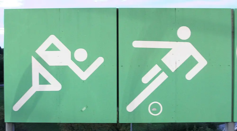
Two large green signs with white stick figures built from straight bars and circles: a runner leaning forward and a footballer kicking a ball.
Picture: Henning Schlottmann (Wikimedia Commons user H-stt). CC BY 1.0.

Otl Aicher

Also called Munich 1972 Olympic pictograms

Where
Ulm and Munich, Germany
When
1922 to 1991; Munich Olympics 1972
Who
German graphic designer
Key works
Pictograms and design of the Munich 1972 Olympics; Lufthansa's identity; the Rotis typeface

Aicher helped found the Ulm School of Design, which opened in 1953 and taught a strict, scientific kind of design. As lead designer of the Munich Olympics, his team drew sports pictograms from a grid, using only straight lines at 45 and 90 degrees, and gave the Games a fresh colour scheme of blues, greens, orange and silver. Tokyo 1964 had used Olympic pictograms first, but Munich's clean style shaped the signs later used at airports and stations. Each Games now draws its own set: UCEED 2017 showed Beijing 2008's, whose figures look brushed in ink to match its logo.

Spot it by

Stick figures built from bars and dots, only straight and 45-degree angles, with no words needed.

Remember

Aicher's athletes are made of bars and a ball for a head.

Type designers

A typeface is a family of letters designed to work together, such as Futura or Helvetica. A sans-serif typeface has no serifs, the small feet at the ends of strokes.

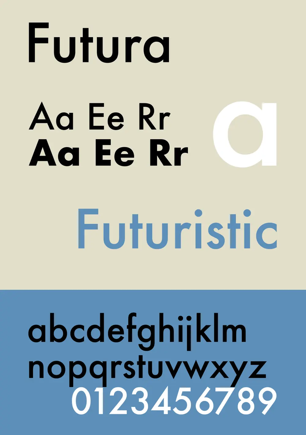
A type specimen of Futura, showing the name Futura, the letters A, E and R in regular and bold, the word Futuristic in blue, and the full lowercase alphabet and numbers.
Picture: ZoeB. CC BY-SA 4.0.

Paul Renner

Also called Futura

Where
Munich; released by the Bauer type foundry, Frankfurt
When
1878 to 1956; Futura 1927
Who
German type designer and teacher

Renner built Futura from simple geometric shapes, a circle for the o, triangles for the A and the v, and straight strokes of even thickness, in the modern spirit of the Bauhaus years. Bauer sold it as "the typeface of our time". It became one of the best-loved typefaces of the 20th century and was a favourite of the film director Stanley Kubrick.

Spot it by

A perfectly round o, a single-storey a shaped like a circle and a stick, pointed A, M and N, and a tall, light look.

Remember

Futura is built with a compass and a ruler.

Don't confuse

Gill Sans is also a 1920s sans-serif, but its letters follow old Roman shapes, not pure geometry.
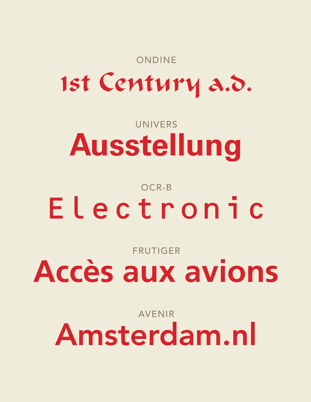
A cream poster showing five typefaces by Adrian Frutiger in red, each labelled in small grey capitals: Ondine, Univers, OCR-B, Frutiger and Avenir.
Picture: Esinconis. CC0.

Adrian Frutiger

Also called Univers and Frutiger typefaces

Where
Born in Switzerland; worked in Paris
When
1928 to 2015; Univers 1957; Frutiger 1976
Who
Swiss type designer
Key works
Univers (1957); OCR-B (for machines to read); Frutiger (1976); Avenir (1988)

Frutiger's Univers came out in 1957, the same year as Helvetica, in a full family of weights and widths numbered on a chart, so designers could pick exactly the version they needed. Later he designed the letters for the signs of Charles de Gaulle Airport near Paris, made to be read quickly, from far away and at an angle. Released for print in 1976 as Frutiger, it is now used on Swiss road signs and in many sign systems and logos.

Spot it by

Clean sans-serif letters with open shapes that stay clear at a distance.

Remember

Frutiger is the typeface of the airport sign.

Don't confuse

Max Miedinger's Helvetica (1957) is in the design movements note. It is tighter and closed; Frutiger is more open.
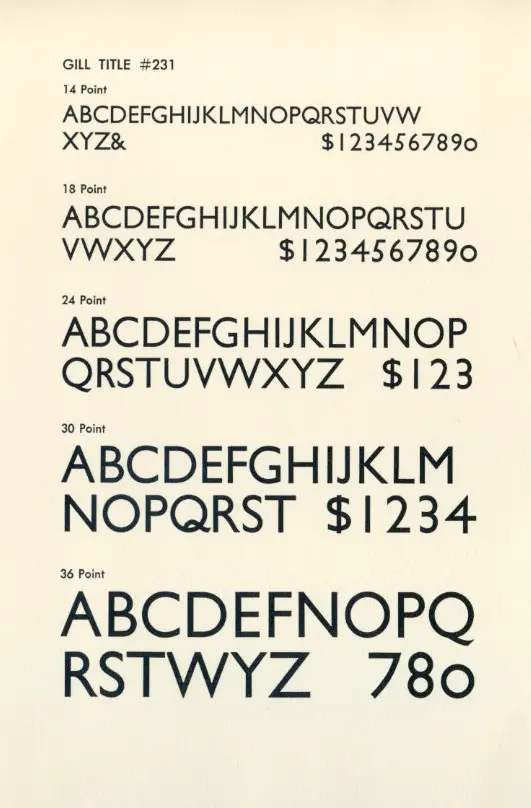
A printed specimen sheet showing the capital letters, ampersand and numbers of Gill Sans at five sizes from 14 to 36 point.
Picture: James Puckett. CC BY 2.0.

Eric Gill

Also called Gill Sans

Where
England; released by Monotype
When
1882 to 1940; Gill Sans 1928
Who
English sculptor, stone carver and type designer
Key works
Gill Sans (1928); Perpetua; Joanna

Gill had helped his teacher Edward Johnston, who drew the lettering of the London Underground in 1916. Gill Sans grew out of that alphabet, but its capitals follow the proportions of Roman inscriptions carved in stone. A year after its release a British railway, the LNER, used it on all its posters and timetables, and it appeared on Penguin book covers and, much later, in the BBC's logo. A 1989 biography by Fiona MacCarthy, based on Gill's own diaries, revealed that he had sexually abused two of his daughters, so his work is now discussed alongside that history.

Spot it by

Classical Roman capitals without serifs, a round O, and a lowercase a and g with old-style shapes.

Remember

Gill Sans is the British sans-serif: from the Underground to the BBC.

Fashion designers

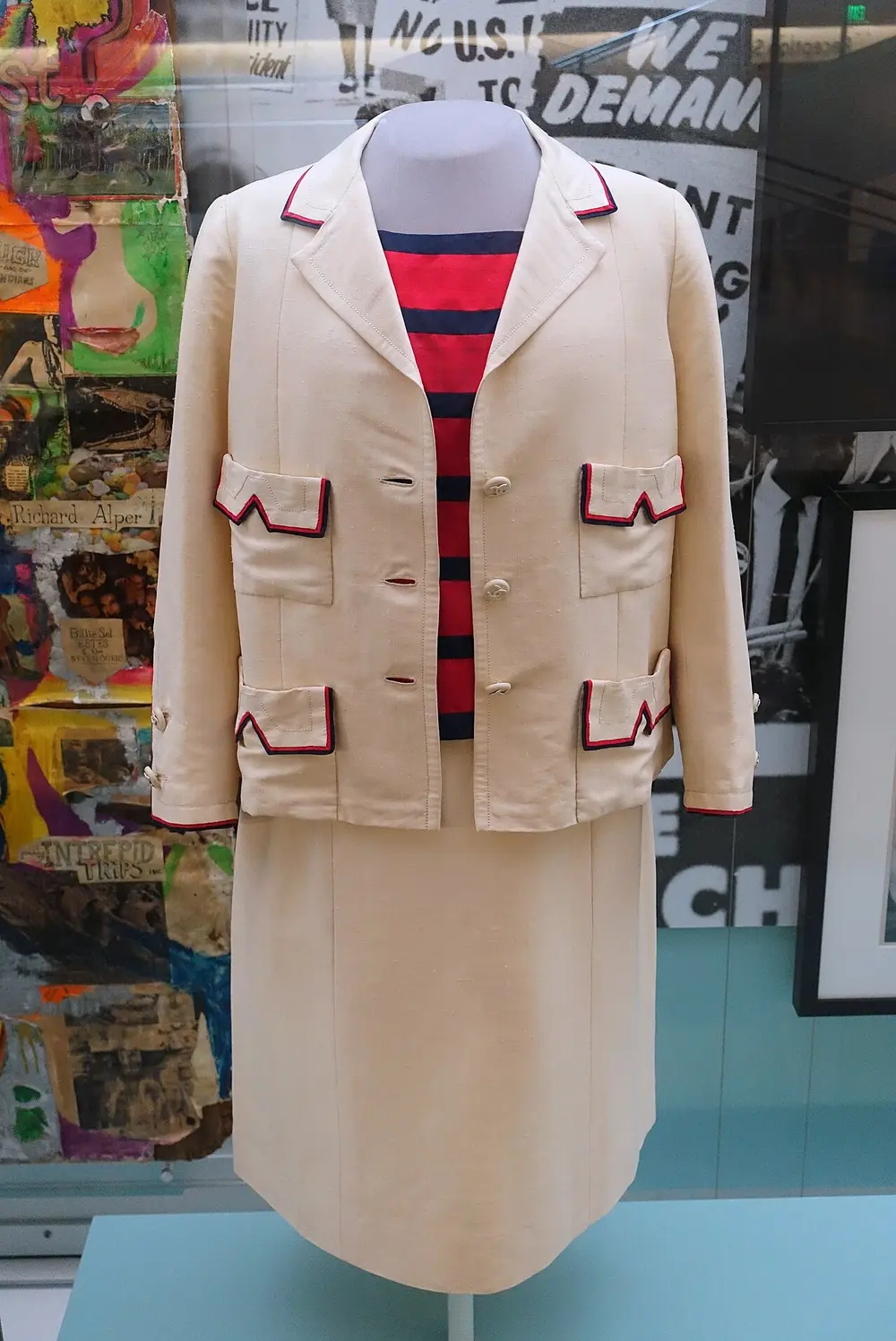
A cream three-piece suit by Chanel on a museum mannequin: a straight, collared jacket with four pockets trimmed in red and navy, a red and navy striped top, and a straight skirt.
Picture: Daderot. CC0.

Coco Chanel

Also called Gabrielle Chanel

Where
Paris
When
1883 to 1971; this suit early 1960s
Who
French fashion designer
Key works
Jersey dresses (1910s); Chanel No. 5 perfume (1921); the little black dress (1926); the Chanel suit

Chanel started as a hat maker in Paris in 1910. She made women's clothes from jersey, a soft knitted cloth then used mainly for men's underwear, and cut them simple and comfortable to move in. In 1926 Vogue printed her short, plain black dress and called it "Chanel's Ford", meaning it would be as common as Ford's cars. After 1954 her boxy suits with braided edges, like this one, became her signature.

Spot it by

Simple lines, black and cream, braided edges, gold buttons and chains, and the interlocked double-C monogram.

Remember

Chanel gave women the little black dress.
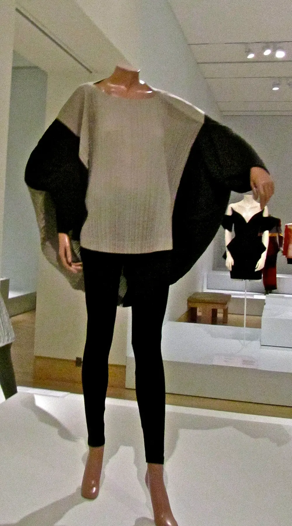
A loose, finely pleated top in grey with huge rounded black and silver sleeves that curve out like a circle, worn over black leggings on a mannequin in a museum.
Picture: ellenm1. CC BY 2.0.

Issey Miyake

Also called Pleats

Where
Born in Hiroshima; worked in Tokyo and Paris
When
1938 to 2022; this Rhythm Pleats piece 1990; Pleats Please from 1993
Who
Japanese fashion designer
Made with
Polyester, pleated by heat and pressure
Key works
Pleats Please (1993); A-POC, "a piece of cloth" (from 1998); Steve Jobs's black turtlenecks

Miyake survived the atomic bombing of Hiroshima as a boy and later became known for clothes made with new technology. Normally cloth is pleated first and then cut. He did the opposite: the garment is cut and sewn about two and a half to three times too big, then pressed between paper in a heated press, which leaves permanent pleats. The clothes are light, pack flat, never need ironing and stretch with the body. His A-POC clothes were cut from a single tube of machine-knitted cloth.

Spot it by

Fine permanent pleats, sculptural shapes that stand away from the body, and simple, wearable cuts.

Remember

Miyake sews first and pleats later.

More names to know

Designer Field Remember them for
Marc Newson (Australia, born 1963) Product Lockheed Lounge, an aluminium chaise; co-founded LoveFrom with Jony Ive (2019)
Paula Scher (USA, born 1948) Graphic Loud, type-filled posters for New York's Public Theater, from 1994
Max Miedinger (Switzerland) Type Helvetica (1957), see the design movements note
Ludwig Mies van der Rohe (Germany) Furniture and buildings Barcelona Chair (1929), with Lilly Reich; "less is more"

Who designed what

Work Designer Year
Studebaker Avanti car Raymond Loewy 1962
LCW plywood chair Charles and Ray Eames 1945 to 1946
ET66 calculator Dieter Rams with Dietrich Lubs 1987
Juicy Salif lemon squeezer Philippe Starck 1990
iMac G3 Jony Ive and Apple's team 1998
Wall-mounted CD player for Muji Naoto Fukasawa 1999
IBM logo (stripes in 1972) Paul Rand 1956
Anatomy of a Murder poster Saul Bass 1959
I Love NY logo Milton Glaser 1977
New York subway map Massimo Vignelli 1972
Munich Olympic pictograms Otl Aicher and his team 1972
Futura Paul Renner 1927
Gill Sans Eric Gill 1928
Univers and Frutiger Adrian Frutiger 1957 and 1976
Little black dress Coco Chanel 1926
Pleats Please Issey Miyake 1993

Timeline

  1. 1910

    Coco Chanel opens her first hat shop in Paris

  2. 1919

    Raymond Loewy arrives in New York

  3. 1926

    Vogue prints Chanel's little black dress

  4. 1927

    Paul Renner's Futura is released

  5. 1928

    Eric Gill's Gill Sans is released by Monotype

  6. 1946

    The Eameses' LCW plywood chair goes into production

  7. 1953

    The Ulm School of Design opens, co-founded by Otl Aicher

  8. 1955

    Dieter Rams joins Braun; Saul Bass's titles for The Man with the Golden Arm

  9. 1956

    Paul Rand designs the IBM logo

  10. 1957

    Adrian Frutiger's Univers and Max Miedinger's Helvetica

  11. 1962

    Loewy's Studebaker Avanti is launched

  12. 1972

    Munich Olympics with Aicher's pictograms; Vignelli's subway map; Rand adds stripes to IBM

  13. 1976

    The typeface Frutiger is released

  14. 1977

    Milton Glaser's I Love NY campaign begins

  15. 1990

    Philippe Starck's Juicy Salif is made by Alessi

  16. 1993

    Issey Miyake launches Pleats Please

  17. 1998

    Apple launches Jony Ive's iMac

  18. 1999

    Naoto Fukasawa's wall-mounted CD player for Muji

  19. 2019

    Jony Ive leaves Apple and starts LoveFrom with Marc Newson

Test yourself

Question 1 of 8

Who designed this lemon squeezer?

Question 2 of 8

Which of these logos was designed by Paul Rand?

Question 3 of 8

Which motto belongs to Dieter Rams?

Question 4 of 8

This moulded plywood chair of 1945 to 1946 was designed by

Question 5 of 8

Which designer led the team that made these pictograms for the Munich 1972 Olympics?

Question 6 of 8

Which of these did Raymond Loewy design?

Question 7 of 8

Adrian Frutiger designed the typeface Frutiger for

Question 8 of 8

This garment was sewn first and pleated afterwards. Whose way of working is that?

From past papers

Real exam questions on this topic, each with a full solution.

Finished this note?

Mark it as studied to track your progress through the course.

Was this note useful?

Each picture is credited underneath it. Pictures of works still in copyright are shown small, for teaching only. If you hold the rights to a picture and want it removed, tell us through the contact page and we will take it down.